
Adapting your website for the visually impaired is crucial. Accessibility is important on time or only 10% French sites are accessible to people with visual disabilities.
However, there are nearly 1.7 million people in France with visual aid devices to browse the web. A societal and SEO issue, accessibility remains complex to implement.
Why optimize your website for the visually impaired? How to improve accessibility by following web recommendations? We tell you everything in this article!
Reasons for adapting your website to the visually impaired
Before explaining how to optimize your website for the visually impaired, let's look at the importance of web accessibility as a whole!
Ethical reasons
The first reason is ethical, of course. As a business, it is your responsibility to provide equal access to your site for people with disabilities.
Computers and the Internet have become fundamental elements of modern life. To have full access to information, resources, culture and administrative procedures, you must be able to access the web. However, we are not all equal in the way we see and understand the information displayed. Hence the importance of adapting to all types of visitors!
Legal reasons
In France, the General Accessibility Improvement Framework (RGAA) is there official French standard web accessibility. Certain actors in the public and private sector have a legal obligation to make their website accessible to visually impaired people, but also to disabled people in general.
This obligation applies to:
- Legal entities under public law.
- Private legal entities with a public service or general interest mission.
- Companies with more than 250 million euros in turnover in France.
Is your company not affected by the RGAA? Nothing says this will always be the case, so it's better to plan ahead.
SEO optimization
Best practices in web accessibility coincide with those of SEO, mobile friendly design and ergonomics.
For example, adding alt text to images and transcriptions to videos are powerful techniques for accessibility, but also for SEO.
Adapting your website to the visually impaired requires organizing and structuring it in a logical, understandable and clearly visible way, using categories, headers and content. This organization also improves your SEO efforts.
Improving your brand image
By making your website accessible to people with visual disabilities, your business will appear socially responsible. You show that you care about others, especially your customers.
This will improve your brand image among your entire audience, which can translate into increased sales.
Access to a new market
Around 2.9% of the French population has a visual impairment. Do you think these consumers will buy from a website that is inaccessible and difficult to use? A study carried out in the United Kingdom revealed that in 2019, 4 million people abandoned an e-commerce store due to accessibility difficulties. Result: a net loss of 17.1 billion pounds sterling for these sites (nearly 20 billion euros).
Keep in mind that people using assistive devices also have purchasing power. By effectively targeting this market, you can increase your turnover.
8 tips for optimizing the accessibility of your website for the visually impaired
Now that you better understand the reasons for making your website accessible to the visually impaired, let's see how to do it!
1) Reduce the number of colors
The more colors you introduce on your website, the more difficult it is for a visually impaired person to quickly identify the content and main links, especially for a color blind person.
For any other user, an excessive number of colors is a source of distraction and confusion. Limit yourself to 3 shades maximum and avoid green and red, to make navigation easier for color blind people.
2) Increase the contrast
Playing with contrasts is important to improve the readability of your content. Here are some good practices to follow:
- Avoid using JavaScript or CSS techniques that prevent highlighting, as many visually impaired people highlight text to increase contrast.
- Meet WCAG 2.1 AA requirements: a contrast ratio of 4.5:1 for normal text and 3:1 for large fonts or bold content.
- For charts, add textures or patterns to increase readability and differentiation between data.
- Use opaque, non-transparent backgrounds so that the color adapts to the accessibility settings of the user's screen reader.
3) Enable manual font size adjustment
Font size is one of the biggest accessibility issues for visually impaired people. To answer this, provide an option for the user to manually choose the typography size. This can be a slider, a drop-down list or a button, like on the Dialogue & Solidarité site:

That said, the default size of your typographies must be large enough to begin with. At least a 16 font.
Furthermore, choose sans serif fonts, which are more readable, such as Verdana, Arial, Helvetica or Tahoma.
4) Use descriptive titles for each page
This is another good practice for adapting your website to the visually impaired! In addition to tags that describe page content, sites should always contain titles that describe the topic or purpose of the page.
The reason? Screen readers announce the page title (the “title” element in HTML markup) when a web page is first loaded. Visually impaired users can reclaim the precious minutes they would have spent scanning a page to determine the type of content it contains.
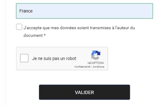
5) Optimize forms
Some visually impaired people rely solely on the keyboard to navigate the Internet, not on mice (the cursor is often difficult to identify). For example, they use the “tab” button to move forward when filling out a contact form.
To make your forms more accessible, you can:
- Use the “tabindex” attribute to indicate the correct order of fields to follow.
- Allow keyboard shortcuts.
- Configure required fields.
- Group similar fields like “last name” and “first name”.
- Create a visible and understandable alert in case of bad entry.
Finally, avoid using a CAPTCHA to validate submissions. Prefer the check box which is much more accessible to people with visual disabilities.
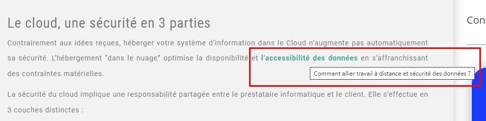
6) Describe the links precisely
People who use screen readers use a keyboard shortcut to list all the links on a page. This helps them navigate more efficiently.
Since this list of links is not surrounded by text, it creates a context-free state. It is therefore imperative to fill in link descriptions to make sense outside of context. A “Click here” anchor will never be effective.
Here is the example of a link with a description which allows you to know the subject to which you are clicking:
7) Offer alternative content
Screen readers can only read text and code. Therefore, to allow visually impaired Internet users to access the information present in visual content, you must use alt text for your images, videos, animations and infographics.
Make sure this description is short and concise. Include only important information. You can use the alt attribute for short descriptions and the “aria-describedby” tag for longer ones.
Don't forget to put periods between each letter of an acronym.
8) Reduce the number of advertisements on your pages
Having too many advertisements on your website can create a poor user experience, especially for people who suffer from visual impairments. Sometimes it is difficult for them to distinguish this type of content from the rest of your page.
For visual advertisements, keep in mind the good practices seen previously (contrast levels, description, etc.) and consider placing the word “advertising” at the beginning of the alt text. This way, visually impaired people will understand that it is an ad and can decide whether they want to click on it or not.
But the real criterion of accessibility regarding advertising is above all to make them easily identifiable and ignorable by screen readers.
4 tools to adapt your website for the visually impaired
To check and optimize the accessibility of your website to the visually impaired, you can use these 4 tools:
1. Color Safe
Color Safe analyzes the background colors, font families and sizes you have chosen, to provide you with suggestions for compliance with AA and AAA standards.
It ensures that your graphic charter remains consistent with your image, while guaranteeing the readability and accessibility of the content.
2. Color Contrast Analyzer
Chrome extension Color Contrast Analyzer allows you to examine any web page, image or PDF open in your browser. The tool identifies elements of content that have color contrast issues.
You can choose to test AA or AAA compliance on all or part of the analyzed page.
3. NoCoffee
NoCoffee is a Firefox extension that allows you to view your website like a visually impaired person.
You will be able to better understand the difficulties encountered by visitors with visual impairments, in order to make better design decisions.
4. Wave
Wave is an assessment tool developed by WebAIM, an American non-profit organization that has been developing web accessibility solutions since 1999.
Wave examines a live website to provide a detailed list of errors, alerts and fixes to make its website visually impaired.
For example, you will be able to know if your pages have empty titles or links, but also if you use Flash or plugins unsuitable for people with visual disabilities.
Our tip for adapting your website for the visually impaired
It's always better to have an outside perspective (no pun intended) to analyze the accessibility of your website. If you want your content to be inclusive, you can call on a professional web designer to adapt your website for the visually impaired.
This good practice will positively influence your image, your natural referencing and your sales. Why not do it? Post an ad now on Codeur.com to recruit a freelance web developer specialized!