
A dashboard is a dashboard that allows you to follow data and their evolution over time to support decision -making and improve performance.
The implementation of a free online dashboard facilitates data visualization (visualization of your data) using diagrams, graphics, cards or icons. Via a simple graphical interface, you can have a precise and deep understanding of the state of health of your business and the progression towards your objectives.
Do you want to know how to build a dashboard that easy to visualize? Discover our advice in this article, as well as 6 tools to create effective dashboards!
6 Dashboard tools to use to analyze your data
To create your dashboards and improve the management of your business, there are complete tools to create visual dashboards. Overview of our 6 favorite tools!
Free dashboard tools
Let's start with free tools to format your dashboards.
1. Googlecharts: Free tool to add graphics to your dashboards
Based in the cloud, the service Googlecharts Allows you to create linear graphics, maps and diagrams, in order to display your main data in a clear and understandable manner.
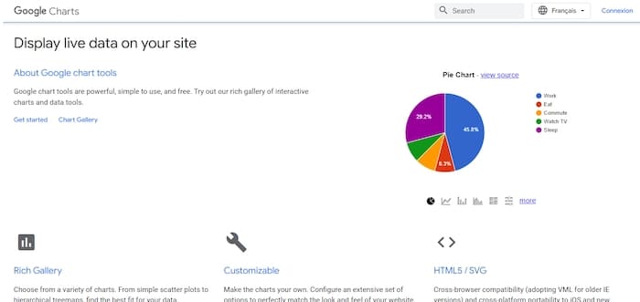
Dynamic, it allows you to obtain information in real time. Which is practical for making quick and enlightened decisions.
Finally, Google Charts presents a library of graphics in which to draw to present your data as well as possible. Each model can be fully personalized according to your needs.
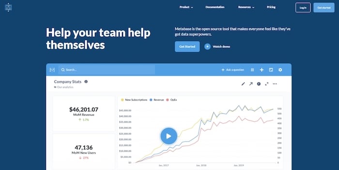
2. Metabase: Create dashboards with this free and open-source tool
Advanced visualization tool, Metabase Allows you to build tailor-made dashboards. With collaborative functions, it allows all members of your team to create, share and organize data. Perfect for monitoring the performance of your various services.
You can connect it to practically all your data sources: Google Analytics, Apache servers, SQL database, Cloud platform…
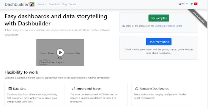
3. Dashbuilder: free dashboard tool
Whether you want to create static or dynamic dashboards, with real -time data, you can use Dashbuilder ! Operating with Java, it offers you the possibility of extracting information from your tables, text files and databases.
You can start from existing models or create your own graphics, from A to Z.
4. Google Looker Studio: Google's free dashboard
A second Google tool allows you to create dashboards for free. This is Google Looker Studio, which allows you to aggregate different sources of data (notably Google Analytics, Google Ads or the Google Search Console) in order to create dashboards.

Very used for the web, Google Looker Studio can be connected to many other data sources and becomes a real very complete Dashboard Marketing to follow the performance of your business.
Paid dashboards software
For more advanced features, we recommend these dashboard creation tools.
5. Table
With Paintingyou automatically update your dashboard with data from applications such as Google Analytics or Salesforce (which is the creator of this tool, by the way).

Its asset? Offer levels to users: creator, explorer or spectator. Thus, you can collaborate on dashboards, but also share them in external teams, partners and customers.
Price: $ 42 User/month (Annual invoicing)
6. Klipfolio
Cloud -based application, Klipfolio Allows you to create and share dashboards, updated in real time, on the web, via television screens and on mobile devices. It connects to more than 100 applications like Twitter, Moz, Pingdom, Salesforce, Google Analytics, Instagram, Xero, etc.
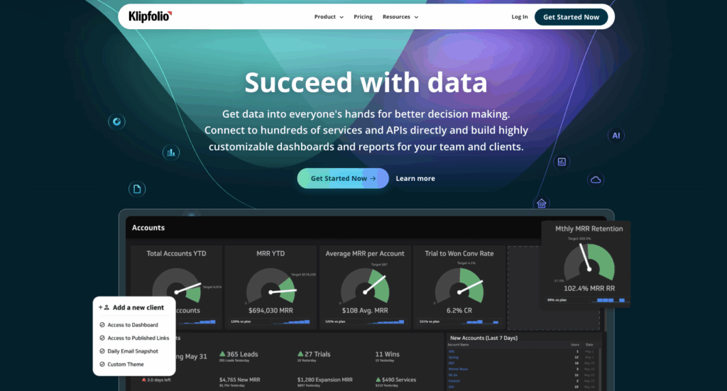
The particularity of Klipfolio? You can create your own formulas, to cross data, and generate dashboards corresponding completely to your needs.
Price: from $ 24 /5 users
The dashboard, the visual representation of your performance
First, let's see the concept of dashboard, or dashboard in French together. This tool aims to follow and present all key performance indicators (KPI) of your business in one place. This allows you to monitor the health of your activity, a service or a specific process.
Indeed, to be fully effective, we advise you to divide it by department or objective: marketing, financial, HR, commercial management …
Dashboard uses data visualization to simplify complex data sets. Instead of reviewing the columns or the lines of a spreadsheet, you can directly analyze your data via a table, a graph or diagrams.
To do this, the dashboard brings together data from various sources. It connects to your files (an Excel spreadsheet, for example), your attachments and your tools (such as a CRM or a marketing automation platform).
It is therefore fully customizable to meet your needs and help you achieve your business goals. You can therefore choose the data to display, as well as the model to use to view the numbers.
Why is the dashboard important?
THE Dashboard is a precious tool For a planned and data -based decision -making. These are transformed into information and easy -to -read usable reports, which avoids interpretation errors, while saving time.
Although it can be used for several things, the primary objective of the dashboard remains to provide you with total visibility of your activity. You know, at any time, what's going on in your business, what works or not.
For example, your Commercial dashboard Can show you exactly the volume of sales since the start of the year, the number of missed opportunities or, on the contrary, which have generated conversions, the number of appointments taken by salespeople, etc. You quickly detect the efficiency of your sales force and any friction points to be corrected (for example, if the number of calls that do not succeed in an appointment is higher than usual, there are surely the correctives to be made).
Among the other advantages, let us quote:
- The possibility of identifying trends
- An easy way to measure the effectiveness of your services
- The possibility of generating detailed reports with a single click
- The ability to make more informed decisions
Different types of dashboards
Whether it is business intelligence, marketing, sales or finance, dashboards can be classified into 3 categories:
The operational dashboard
Generally used by production plants, the operational dashboard offers a complete and instant preview of performance related to day operations. The data it contains is updated in real time.
The strategic dashboard
This type of dashboard is used to align the performance of departments on the overall company strategy. It is used to examine performance data from the last quarter, for example, and compares it to the current period.
The data from strategic dashboards is static for a given period and is updated less frequently than operational dashboards.
The analytical dashboard
An analytical dashboard contains a large amount of data created and intended for managers. It provides the company with a complete overview of performance, is used to identify trends, compare data and create predictions as well as objectives.
Read also: 6 reasons to use Google Data Studio for your reporting
Understand the visualization data used in a dashboard
To put it simply, the visualization data constitutes a graphic representation of the data. It presents the latter in the form of an image or a graph to facilitate the identification of diagrams and the understanding of difficult concepts.
Thanks to technology, you can make data visualization interactive by creating dashboards on which users can click to see more details, for example.
The assets of data visualization
There Data visualization There remains an effective way to universally share complex concepts. For what ?
- The visuals are more effective than the text: “An image is worth a thousand words”, it is well known!
- The diagrams and graphics transmit information faster than a large calculation sheet or a report: especially when you know that in average, companies use 400 data sources managed in 6 different tools (according to IDC and Gartner).
- Visual metaphors are a universal language: if you work with different nationalities, everyone will have the same understanding of information.
The techniques used in data visualization
To present the data in dashboards, several techniques are used such as linear graphics, diagrams, cards … Everything will depend on your needs.
Linear graphics show you results at time T, but can also help you compare periods. The diagrams have distributions, while the cards show trends. The whole thing is to find the model that will best transcribe the information necessary for your decisions.
The key, to choose the adapted dashboard format, is to ask you these questions before the editing of each graph:
- What is the data that must be put forward?
- Do I need to compare it to another? If so, which one?
- Who should the information be presented for?
This last question is essential, because employees do not all need the same level of information. While a manager can be satisfied with global KPI on the income generated, the sales manager will surely want to know the performance of each point of sale or each salesperson.
Our tip for creating dashboards
Dashboards occupy an important place in the growth of a particular business or department. However, recolling data and creating dashboards are chronophagous tasks. The secret? Automation! By automating your reports, you have constantly updated information to best control your activity.
We advise you to call on an expert freelance in analytics to help you manage your dashboards and the analysis of your data. Post an advertisement now on Coder.com To find a Consultant Analytics Who can accompany you to set up dashboards and boost your business!