
The management of the flotation line is an important part in the website design.
What elements to place above the floating line? What impact on natural referencing? What about the difference between mobile and desktop?
Concept often neglected, the flotation line always requires the consideration of website creators to offer a good user experience.
What is the flotation line?
The concept of the flotation line, “Above the Fold” in English, dates back centuries, at the beginnings of the printing. “Above the Fold” means “above the fold”. The newspapers, due to the way they were printed on large sheets of paper, were folded once they arrived in newspaper kiosks. Therefore, only the upper half of the paper is visible for the passer -by.
The press industry quickly realized that to capture the attention of readers, it must present titles, content and images that draw attention to the upper half of the page. This basic principle remains the same for digital content.
Of course, websites do not have physical folds like newspapers. Here, the “fold” relates to the scroll bar. Everything that is not immediately visible, and which requires scrolling, is therefore considered under the fold, under the flotation line.
Unfortunately, the concept of a flotation line is not as simple as its paper version. Indeed, how to know where the flotation line is when, nowadays, no screen is identical to another?
Since the advent of tablets and other smartphones, each site is very different according to the Internet user. Not to mention the problems of screen resolution, browser, screen type (OLED, RETINA, etc.).
Smartphones, which now represent a very large share of web traffic, are presented in different forms and sizes, as well as their screens, and their resolution. Unlike a paper journal, the flotation line is a much less predictable concept.
Here is the example of a poorly managed flotation line, with cut content.
How to manage the flotation line?
If it is true that there are no strict rules for what to display above the flotation line, certain practices often constitute useful guidelines.
Some are common sense ideas, such as ensuring that the most engaging content is above the flotation line. You can also choose to designer your site according to the most common sizes of each of the supports – office – mobile – tablet. A responsive sitethis is the norm today!
However, it is important to never take the “best practices” at the foot of the letter. For many years, websites have been designed as the first pages of the newspapers, but this led to a kind of “templatisation”, where the majority of the sites were alike.
Innovations, such as “One-Page” sitesnotably started to get rid of the concept, and provide a much more natural experience for the reader.
If you want to stay on a simple concept, and that will not change anytime soon, place your important information: shock image, punchline, Call-to-actionas high as possible in your pages. The most important content, first.
Be careful, you have to keep a balance and not put everything either, at the risk of making your page confused.
Example of the flow line management
To fully understand how it is possible to intelligently manage the flotation line of a site, let's analyze an example.
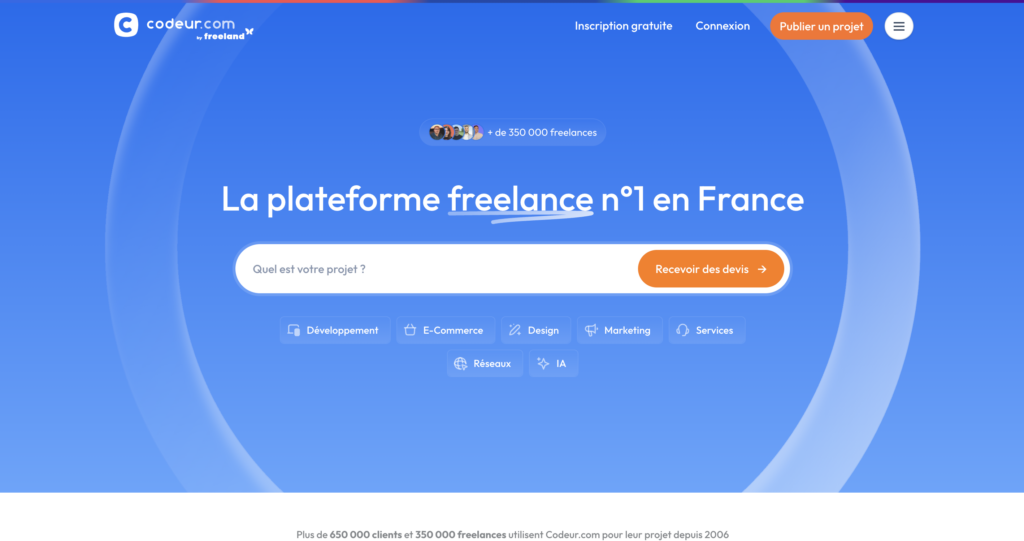
Example of a flotation line on desktop
For example, on our freelance coder.com platform.comthe most important elements are located above the flotation line:
- The navigation menu to register
- A strong grip
- A CTA in search bar format
- Reinsurance elements
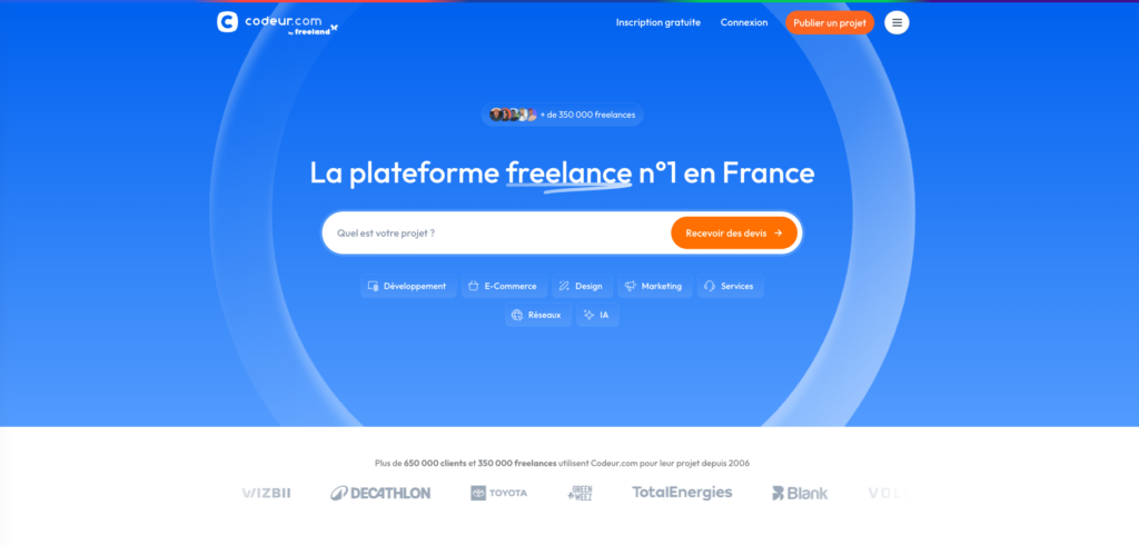
In anticipation of a screen with smaller dimensions or with a different ratio from 16: 9, there are not too many elements on the width. Likewise, the white reinsurance headband is discreet. When it is visible, it contrasts with the blue background and is visible, but there is no shortage of it and does not shock if it is no longer visible or cut.
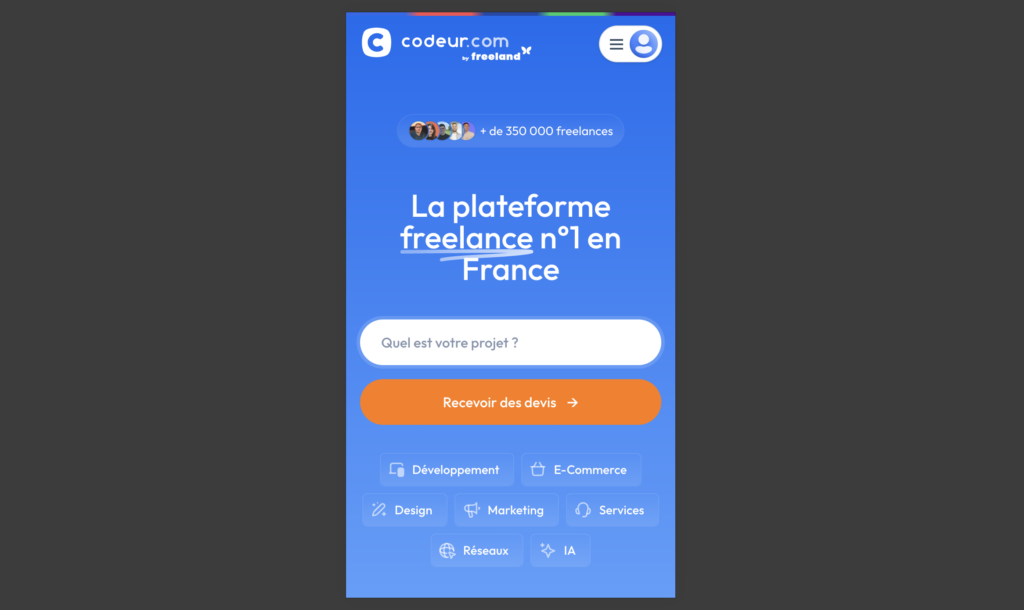
Example of a flotation line on mobile
In the mobile version, the content display is suitable to match the format.
The search bar with CTA is separate is two, but all of the same elements are present above the flotation line.
The management of the mobile version of a website is essential, because many Internet users are sailing exclusively on mobile. It is therefore important to check in your analytical tool (Google Analytics, Matomo, etc.) what is the share of mobile navigation and desktop and check that your site is well optimized.
Optimize content above the Flotation line of its website
There are many online tools to help you like thermal map. A thermal card collects data from real -time users on how they interact with the website and displays the results using different colors such as dark red highlighting the part of the frequently used page, yellow for moderately used parts and light green for the least used sections.
This allows you to see how Internet users interact with the content of your site. The poor positioning of a CTA above the flotation line, for example, can decrease your conversion rate.
Do not neglect the flotation line
Abstract concept when you don't know it, the flotation line will never disappear.
With a responsive site, and only placing the most important things on the first screen, you will mostly have a correct rendering. But it is essential to ensure that its site performed above the flotation line!
If you plan to make a Redesign of your website Or you need to optimize your pages above the floating line, call on an expert.
Put a free project on Coder.com for free to be accompanied by a Freelance web developer !